


Color Mixing Guide For Milk Paint
The Real Milk Paint Co. carries a variety of Real Milk Paint® colors to suit numerous do-it-yourself projects. Fortunately, when you require custom shades such as cool brown, phthalo blue or cadmium yellow, these Real Milk Paint colors mix easily together to help you get a look that perfectly suits your particular needs.
Whether you want complementary colors, neutral shades or high-contrast hues, we have you covered with Real Milk Paint powder that runs the gamut from basics to brights using primary colors, secondary colors and tertiary colors.

Color Mixing Milk Paint Basics
When mixing milk paint colors, keep in mind that the principal color you use should be greater mass than the add-in shades. For instance, if you’re color mixing milk paints such as Barn Red and white to create a slight shade variation of warm brown for your fence, you need the Barn Red color to be greater amount than the white.
If, however, you want to mix a much lighter shade, you want the white to be the greater amount than the Barn Red. Also, a color mixing chart usually have the principal hue listed first and the secondary color listed after by their order of volume.
Unlike acrylic paints or oil paints, Real Milk Paint is a forgiving medium that works well for custom blends, there’s no wrong way to go when mixing milk paint colors. To achieve the results you want, mix colors a little bit up in the recommended proportions, then experiment by adding a little more black or white, depending on your needs.
Creating Complementary Milk Paint Colors
Mixing complementary colors with Real Milk Paint is simple when you have white to lighten hues and black to darken shades. For example, if you want to achieve light brown, mixing four parts color with one part white typically creates a slightly lighter tone, while mixing four parts color with one part black creates a slightly darker hue, so that would work if you for example want a dark blue shade.
This technique for color mixing milk paint works well for when you need variations of the same shade to highlight drawer fronts or to craft a subtle two-tone effect that ties together other design elements in your space.
Color Mixing Milk Paint for a Neutral Look

When you want a much paler shade of Real Milk Paint to bring neutrality to furnishings with bright detailing, mix one part of your desired color with nine parts white. This mixture creates an almost-white base with just a hint of tint, adding a clean yet warm feel to your room.
You can use these neutral shades on their own or pair them with brighter or darker mixes of the base color to create bold contrast on everything from cabinets and armoires to side tables and vanities. Additionally, these lighter shades make a great choice for covering floors and walls with a durable yet washable finish that looks great over time.
Mixing Milk Paint Colors for a Custom Look
In addition to lightening and darkening Real Milk Paint, you can also create custom colors by mixing primary and secondary hues. For example, since red and blue mixtures create purple shades, try mixing Barn Red with Blue Lagoon to get a warm yet vibrant purple hue, then lighten or darken it as needed with white or black to get the right look.
Likewise, mixing yellow and blue hues leads to various shades of green including yellow green, while red and yellow mixtures create shades of orange including red orange.
If you want to mix classic 1870s color combinations ideal for farmhouse projects, consider formulations in the guide below. Reproduced from the out-of-print Dick’s Encyclopedia of Practical Receipts and Processes by William B. Dick, this chart offers useful formulations for color mixing milk paint.
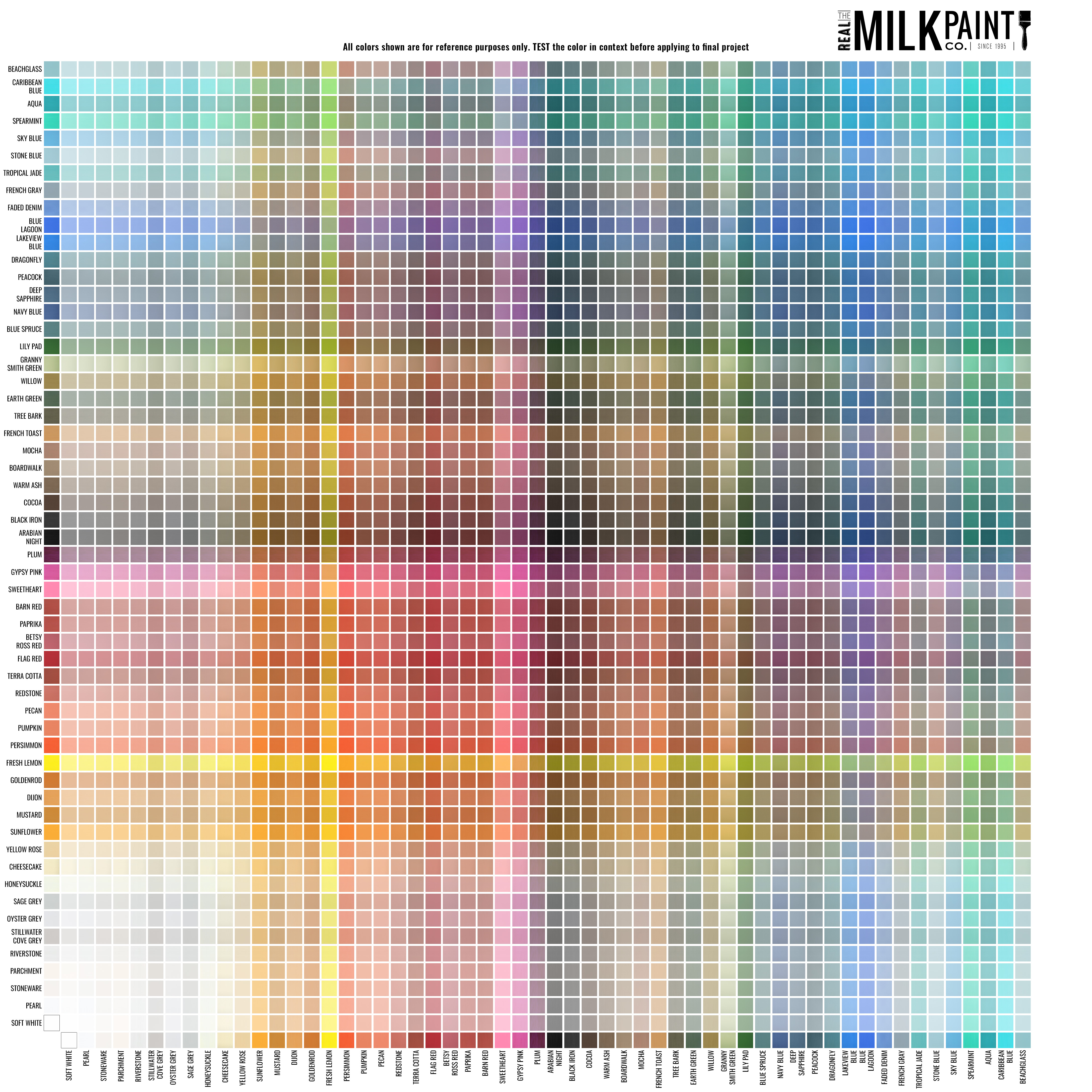
How to use the Gradient Guide
Turn 56 colors into hundreds! With this handy milk paint mixing guide, you can create your own custom colors using Real Milk Paint. Learn more about our Real Milk Paints or view our pre-mixed paint colors here.
NOTE: The color mixing chart below are for reference only. Please test primary colors and secondary colors before applying them to your final project.
The best way to create your own custom milk paint color is to mixed the milk paint powders together before adding water. By doing this, you can easily measure and record the amounts used for future reference. The guide uses “parts” so that any amount of powder can be used for mixing. For example, if the guide says 3:7 it is communicating that the ratio is 3 parts of one color and 7 parts of another. A “part” could be any measurement amount. It could be 3 tbsp: 7 tbsp or 3 cups: 7 cups.
In the guide below, the second number refers to our Soft White color and the first number refers to the color shown. For example, 9:1 in the first row would be 9 parts of Pearl and 1 part of Soft White.

How to use the Color Mixing Guide
This guide’s intention is to show what Real Milk Paint colors would look like if mixed at a 1 part to 1 part ratio. For example: Mixing 1 part of Fresh Lemon with 1 part Blue Lagoon produces a vibrant green. This milk paint mixing guide should serve as a starting point for your own custom color creations! Click on the image to open a larger image in a new window for easier navigation.
Calculating Milk Paint Needed
If you have a large project and you need to figure out the recipe for 3 parts to 7 parts, this is the math we use:
Let’s say your project area is 100 square feet and you need two coats, so it would be 200 square feet that needs to be covered with paint. (100 x 2 = 200) For a 3 parts to 7 parts ratio, the total amount of parts is 10. So there are 10 parts in the mix, 3 of one color and 7 of another. Our project required 200 square feet which can be divided by the total amount of parts, 10. (200/10 = 20) Now, we multiply the parts by 20.
20 x 3 = 60 sq. ft.
20 x 7 = 140 sq. ft.
Each Pint of milk paint covers 35 sq. feet, a quart covers 70 sq. feet and a gallon covers 280 sq. feet.
So, you need 3 parts of one color to cover 60 sq. feet. A quart of that color would be sufficient.
You need 7 parts of the other color to cover 140 sq. Two quarts of that color would do the trick. Resulting in a total of 10 parts of milk paint, 3 in one color, and 7 in the other.
Find out more about painting techniques with our painting resources section.